Modernization and continuous improvement in the Albus experience
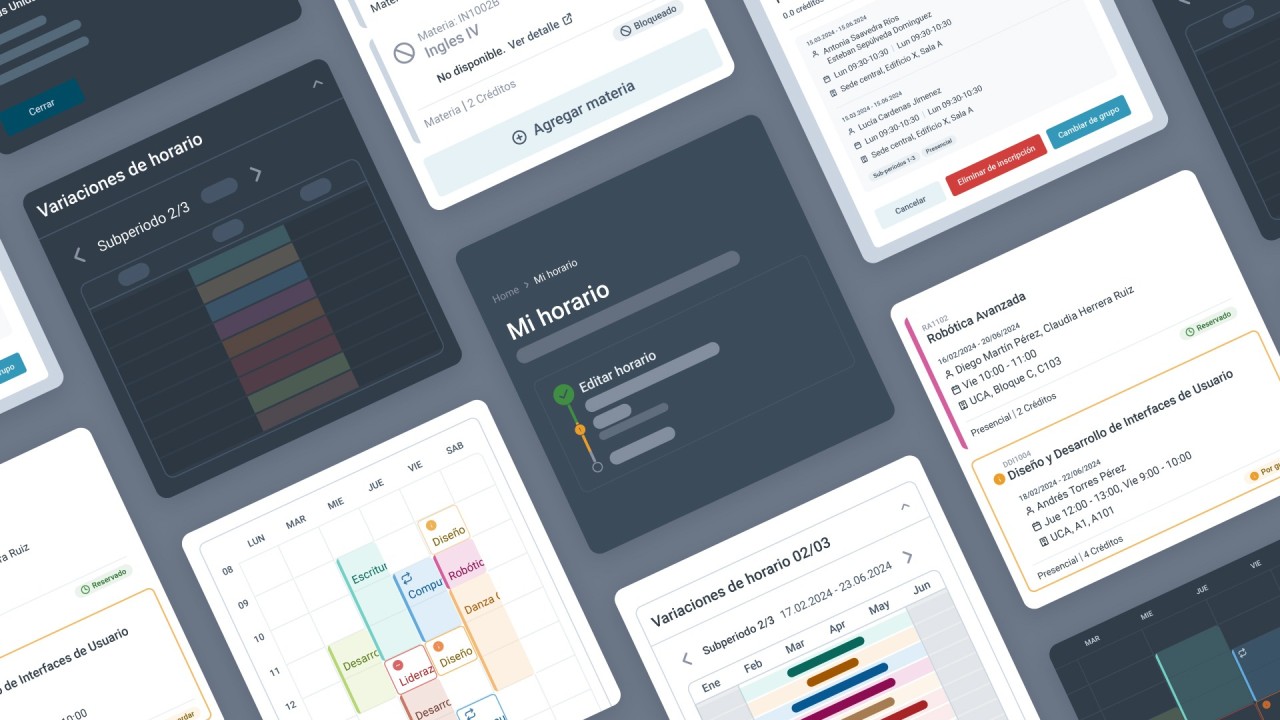
Our latest Albus update is based on extensive trend research and constant monitoring of how our users behave, which lets us continuously identify and resolve points of friction.
User feedback is key to improving our solutions, and today's updates are no exception.
We worked directly with students to understand their needs and made significant changes that improve the workflow. Our ongoing testing also ensures the platform stays optimized to always deliver the best.
As we enhanced the Albus interface, we found two key areas where we could make a difference...
Continuous design innovation
We researched design trends and best practices to adapt the interface to our users' needs and make sure the product feels modern and up to date. To do this, we interviewed students, analyzed their post-enrollment feedback, and used those insights to optimize the experience.
An inclusive experience
To address web accessibility challenges, we adjusted text sizes and app colors to meet standard accessibility criteria.
We simplified the language and adopted new design techniques to make the content easy to read and understand.
We also carefully reviewed every view in the app to highlight essential content and make it easier to use.
Schedule proposal
Innovations that elevate the Albus experience
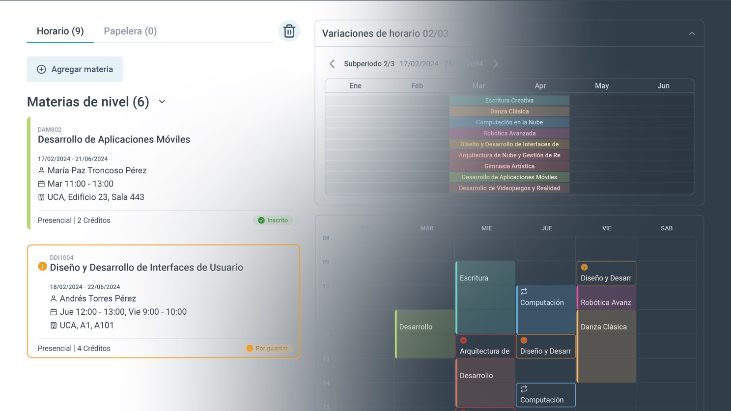
- Modern design: we redesigned the interface following the latest web design trends and best practices, ensuring an attractive, functional experience. Enjoy more intuitive interactions that let you complete tasks in fewer clicks and shorten the learning curve!
- Optimized colors: we adjusted the colors to meet accessibility standards, integrating the brand's palette in a functional way.
- Accessibility: we improved contrast and readability and added icons to reinforce actions and messages, improving the experience for users with visual impairments.
- Simplicity: we reduced distractions, highlighted critical content, and improved clarity so users can focus on their tasks with less cognitive load.
- Contextual help: we introduced new naming and visual elements to make navigation easier and help users find their way around the platform.
The most anticipated feature: turn on Dark+ mode
The feature everyone was waiting for is here! We've added dark mode to Albus to give you a more comfortable experience.
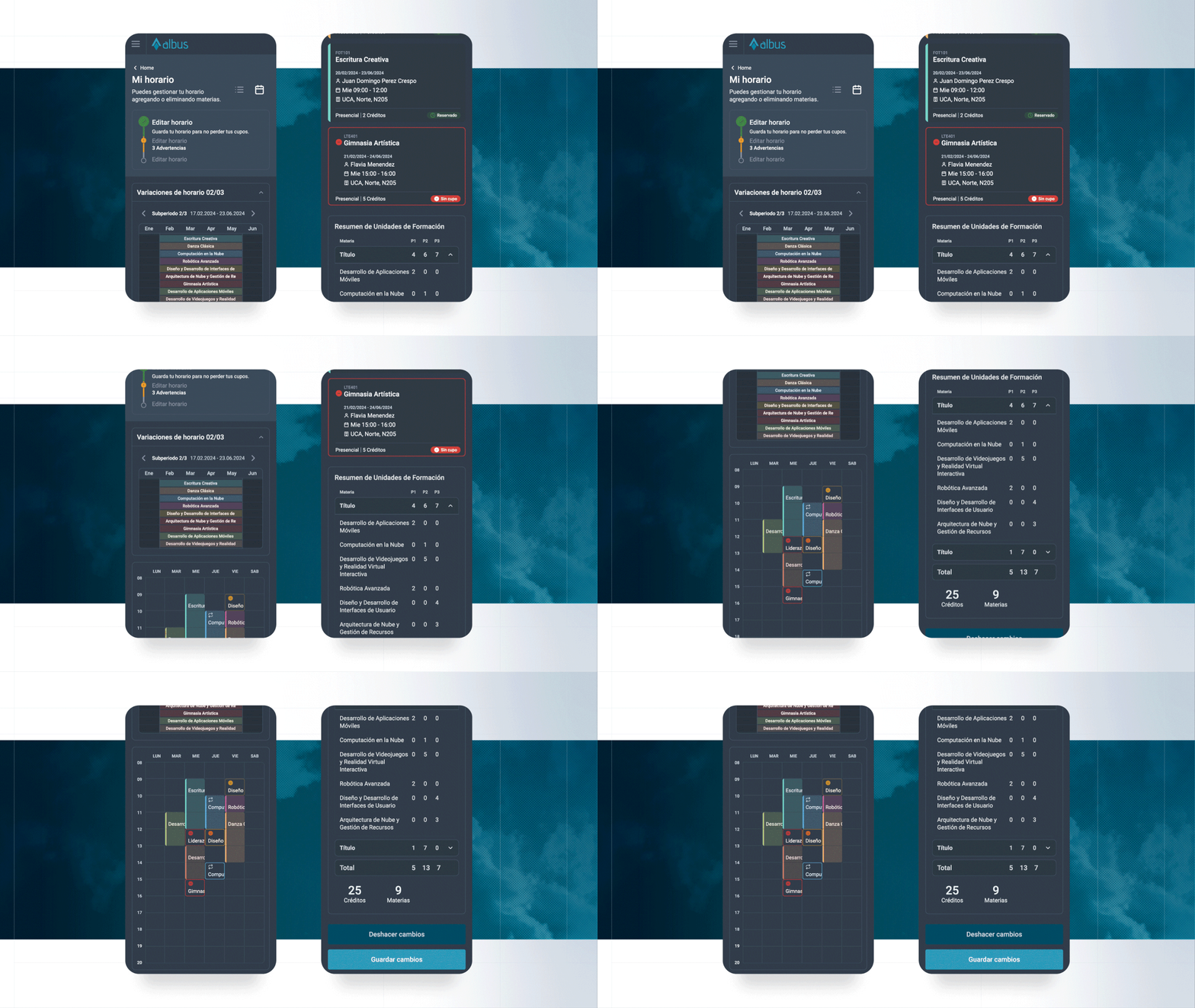
This update is a big step toward a more accessible platform. Here's what you can expect:
- Gives your eyes a break, especially in low-light environments.
- Saves battery with dark mode, a crucial advantage for anyone who uses Albus on a mobile device.
- Lets you open the platform and easily choose your display mode. Switch it whenever you like in just a few clicks.
- Improves readability with higher contrast between text and background, ideal for users with visual impairments.
- Offers a modern, visually appealing design that many users prefer.
- Lets your students personalize their experience by choosing the look that best suits their preferences.